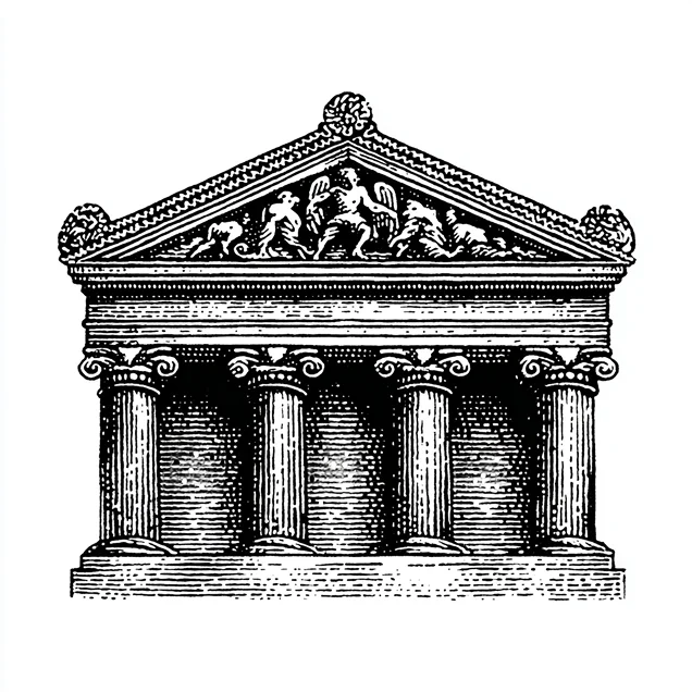
House illustration · engraving
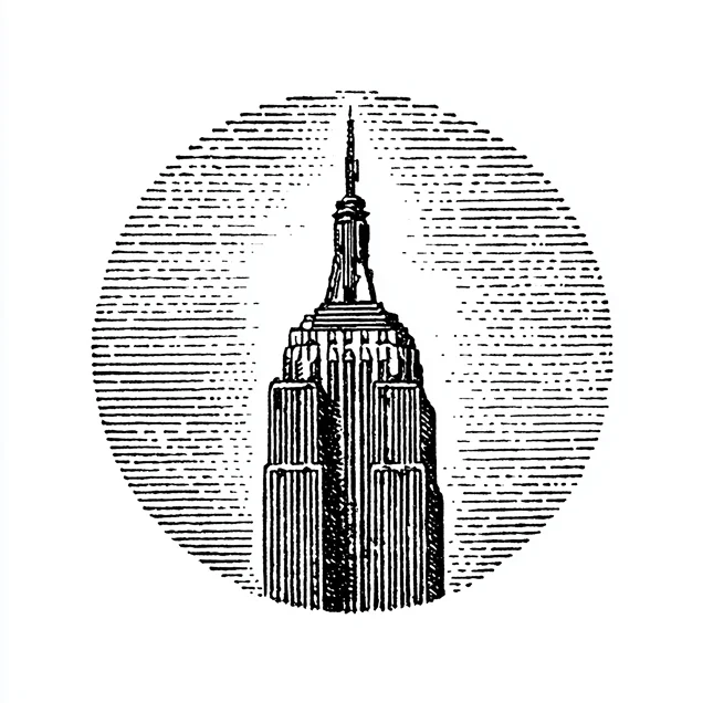
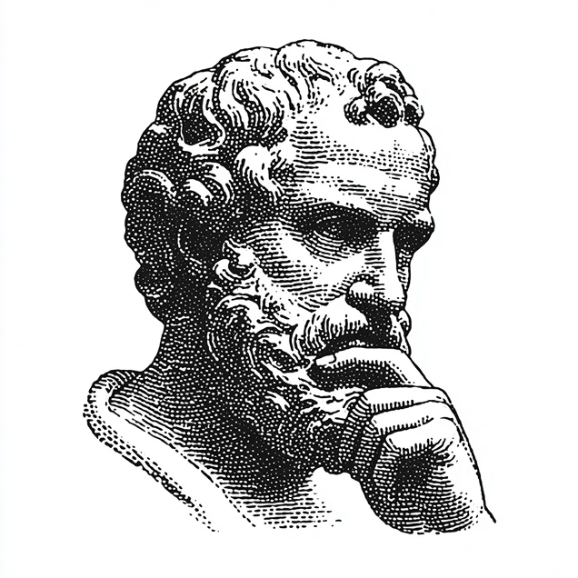
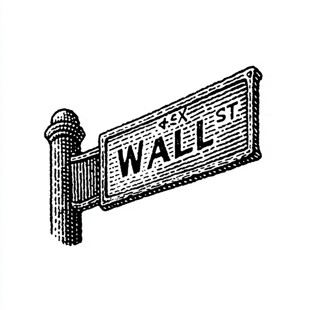
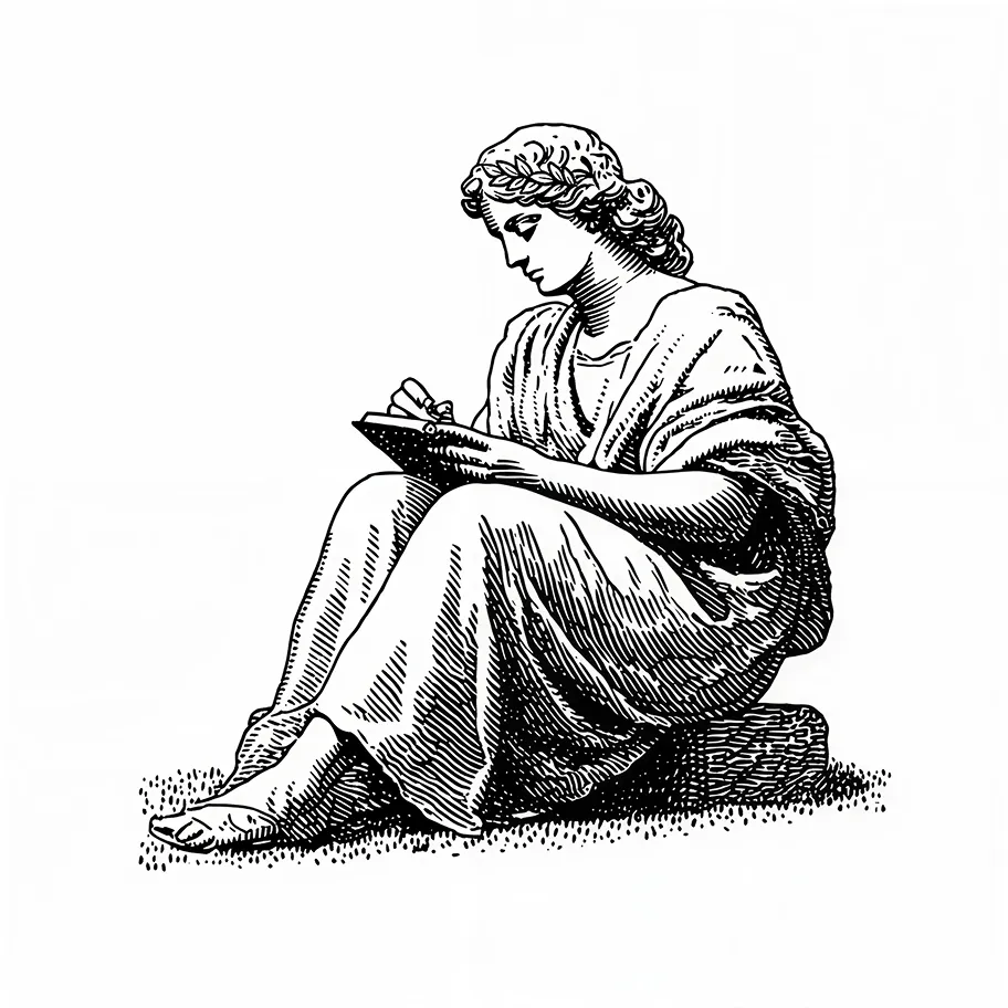
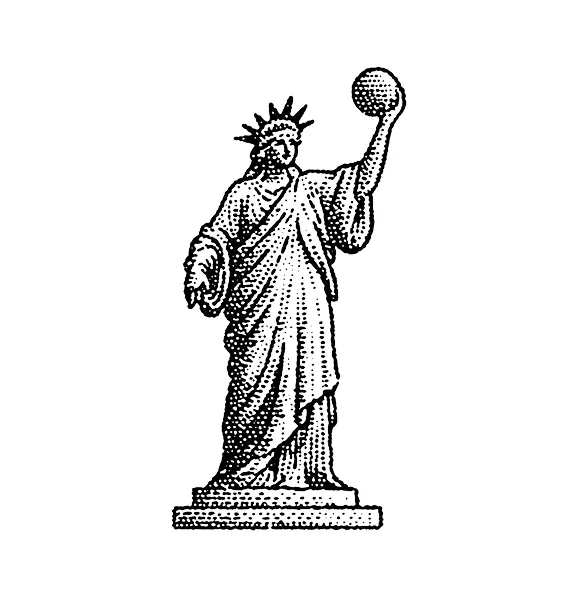
Our illustration language is fine-line engraving in the Wall Street Journal tradition, the hand-worked hedcut you find in the financial pages. Black and white, precise, unhurried. Use it for institutions, architecture, objects, and portraits that give a page gravity.
Photography
We lead with engraving, not photography. Photography is held in reserve for the moments that call for real people, a portrait or a team in context. We do not reach for it unless showing people genuinely serves the story. When it earns the room, keep it neutral and editorial: natural light, honest depth, black and white or a restrained duotone so it sits beside the engravings without competing.
Principles
◎ Do
- Use fine-line engraving and hedcut illustration in black and white.
- Shoot editorial photography with natural light and honest depth.
- Keep the palette neutral and let green appear sparingly, on purpose.
- Leave generous margins and hold to a broadsheet sense of order.
✕ Don’t
- Don’t use glossy 3D renders, glowing circuitry, or floating holograms.
- Don’t reach for stock “AI” clichés or staged lifestyle shots.
- Don’t add heavy saturation or gradients that fight the engraving.
- Don’t let spectacle replace people with effects.