
Desktop HD
Desktop HD
1440 × 1024px
12 Column
Type Center
Gutter width 30px
Column width 65px

Desktop
Desktop
1024 × 1024px
12 Column
Type Center
Gutter width 30px
Column width 50px

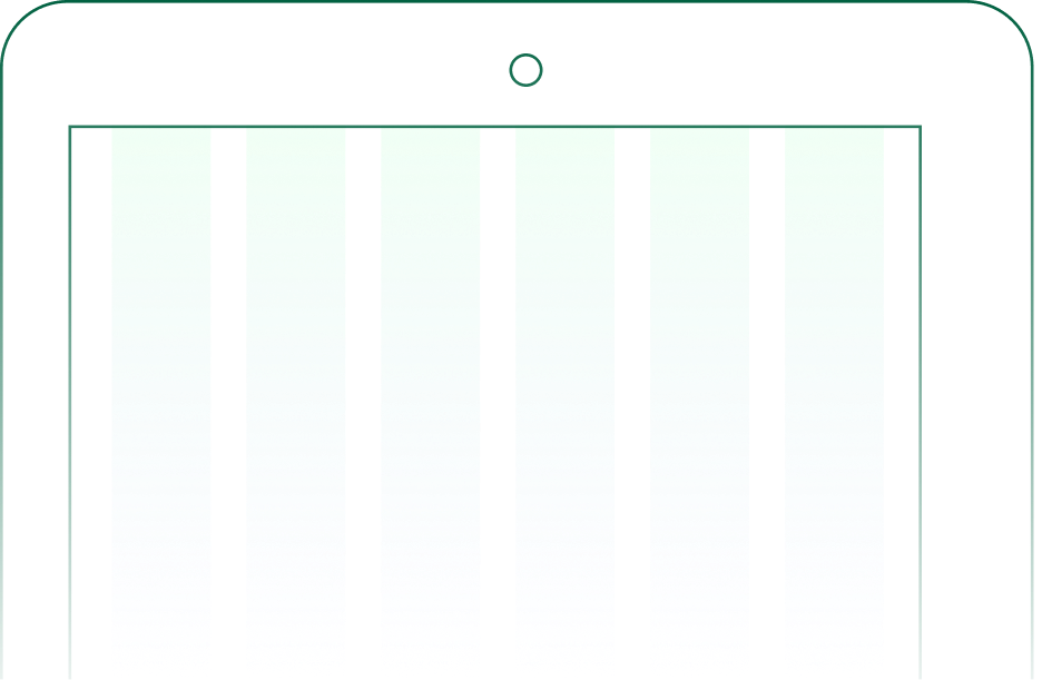
Tablet
Tablet
768 × 1024px
6 Column
Type Center
Gutter width 30px
Column width 88px
Mobile
Mobile
320 × 1024px
2 Column
Type Center
Gutter width 30px
Column width 130px

Spacing
Spacing steps through a fixed set of values in pixels. Pick from the scale rather than inventing one-off gaps, and padding across the system stays consistent.
8px
16px
24px
32px
40px
64px
80px
96px
120px